
Graduation Project | Case Study
_
Design Rationale
The visual identity of each element was set by clear parameters established during the research process. The target audience and identified keywords helped tie the visual elements to a unique and effective solution.
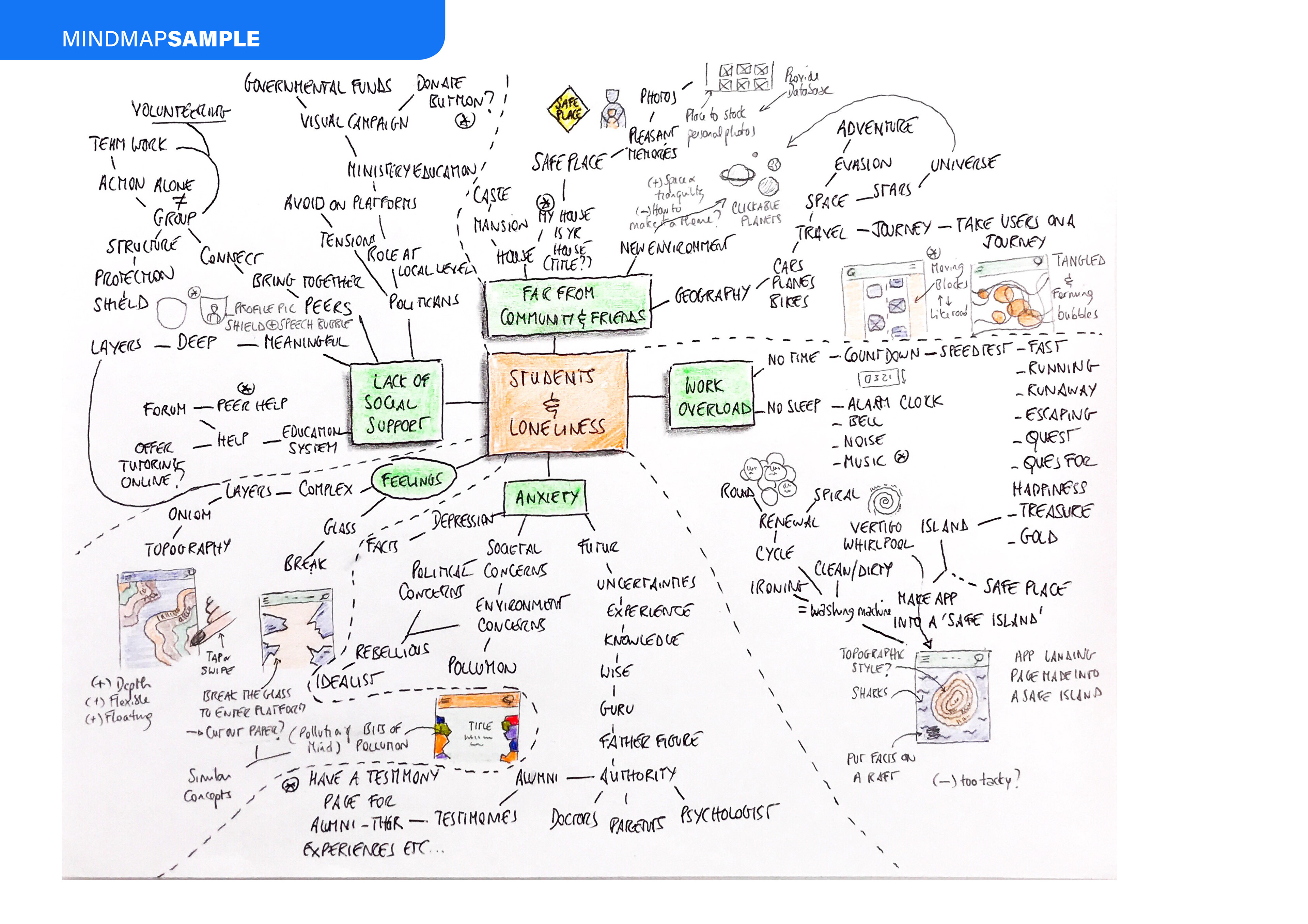
Visual methods, including mind-mapping and mood-boarding were employed to first establish, and then refine the tone of voice. They helped in creating a varied set of ideas and rationales. The strongest concepts were brought forward for the development of the deliverables.
Research, sketching and the ideation processes helped identify the rationale that a bright, contrasty and unconventional colour palette, allied with floating and juxtaposed shapes and objects–for being the opposite of rigidity, structure, grids or restrictions–connote bonding, freedom, flexibility, malleability, and above all, positive change.
_
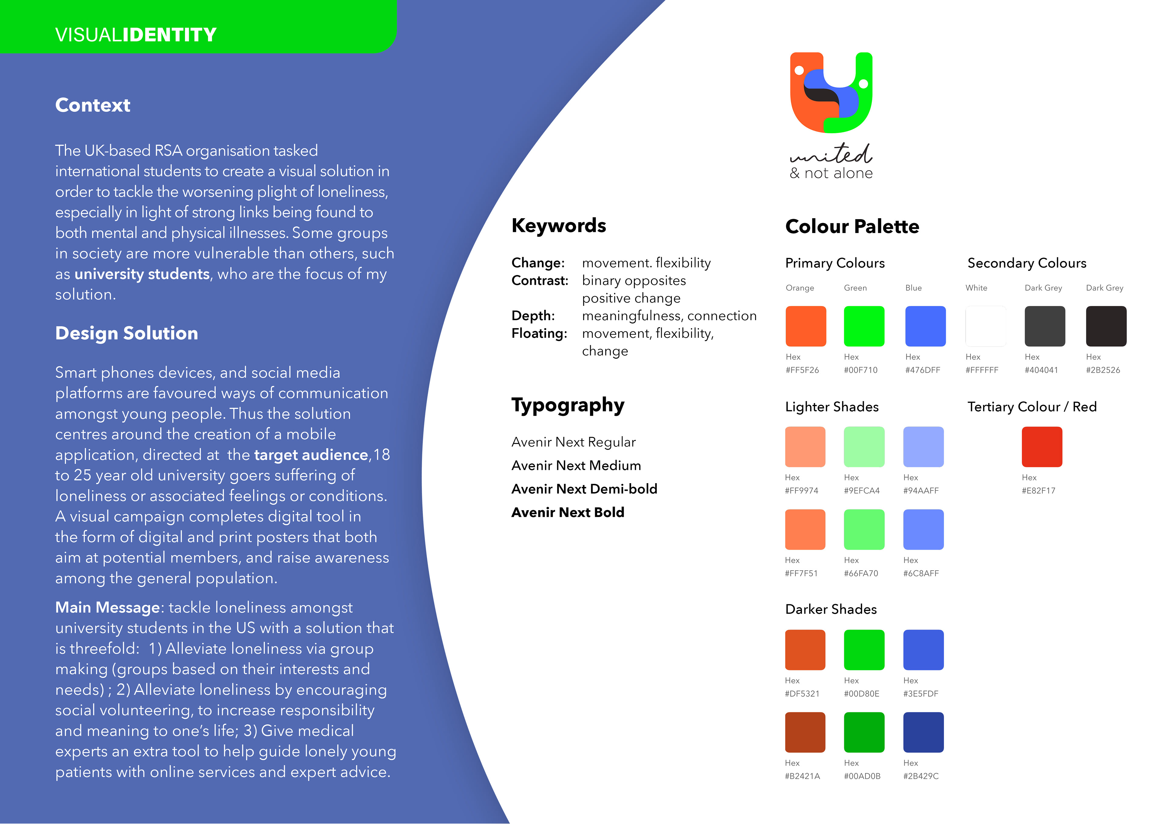
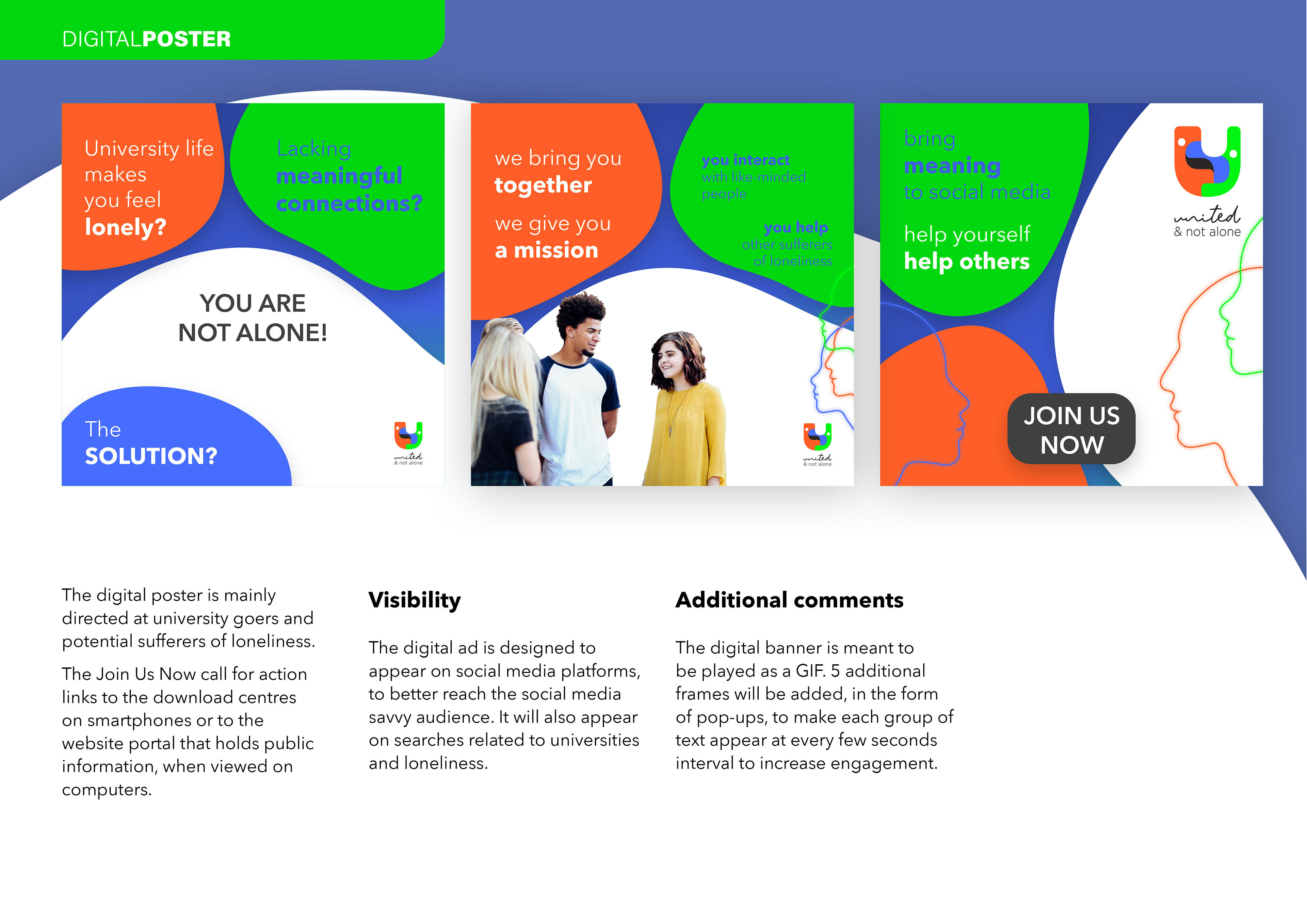
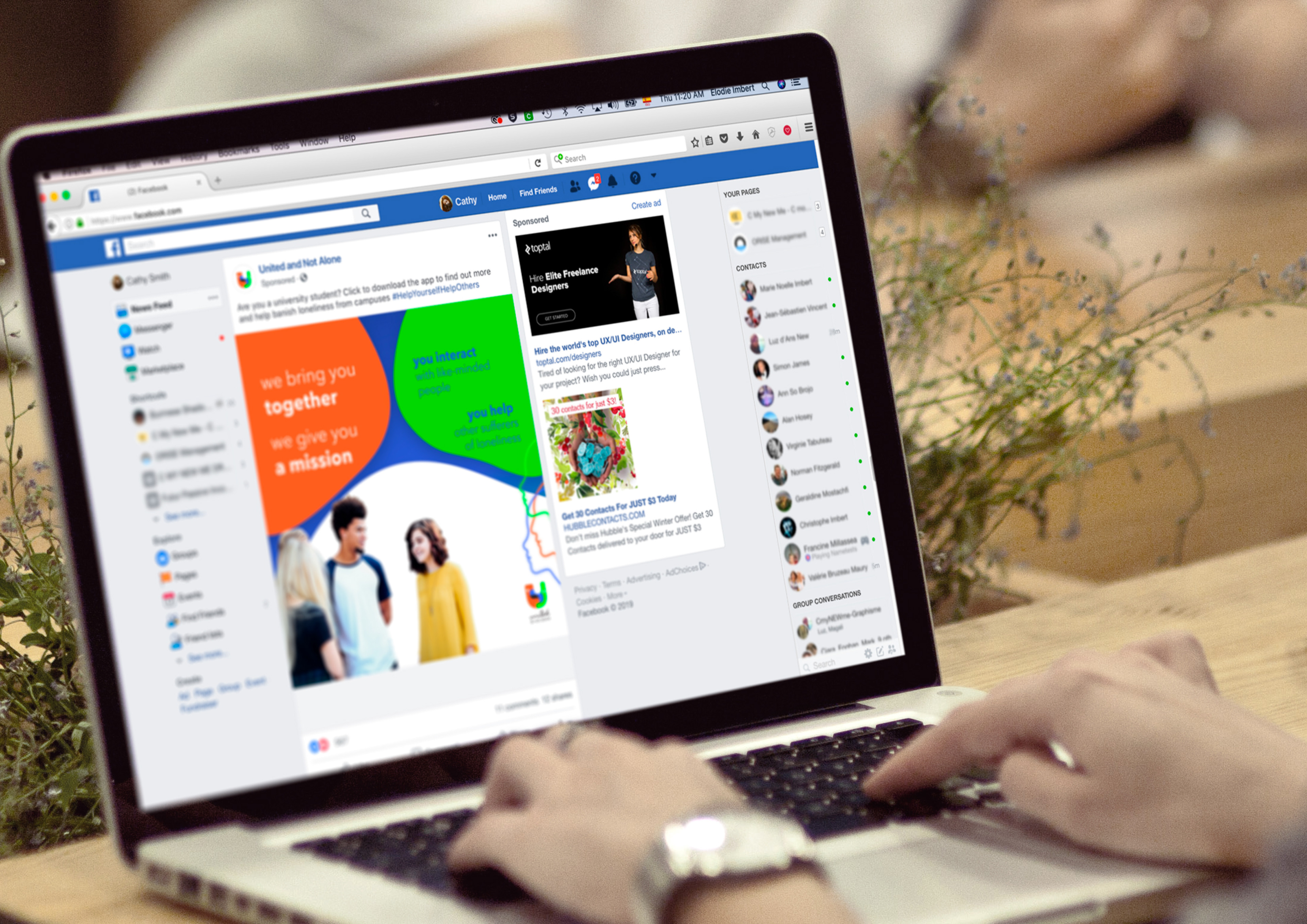
Naming the Organisation
The chosen name United & Not Alone evokes the fact that people getting together are better equipped to fight loneliness. Two tag-lines are used intermittently. 'Help Yourself Help Others' communicates the second core intent of the application, volunteering to help other sufferers, such as seniors. 'Bringing Meaning to Social Media' promotes the organisation as an alternative to traditional social media, and as a way to reclaim real and valuable interactions.
_
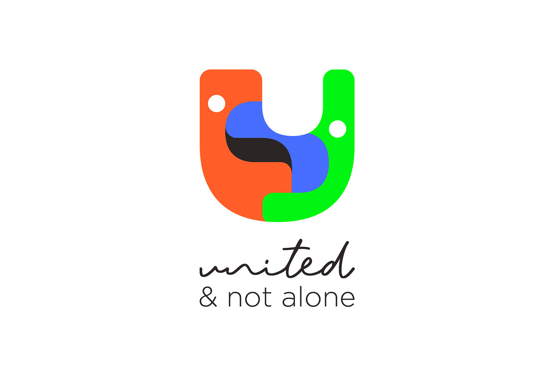
Logotype
The logo was created on the premise that bonding and interaction will fight loneliness. It is formed by a stylised letter U with white dots, abstractly representing people, bonding and interaction.
The combination of cursive (Tiffany script) and sans-serif (Gotham) produce a soft contrast that highlights the approachability and humanity of the organisation.
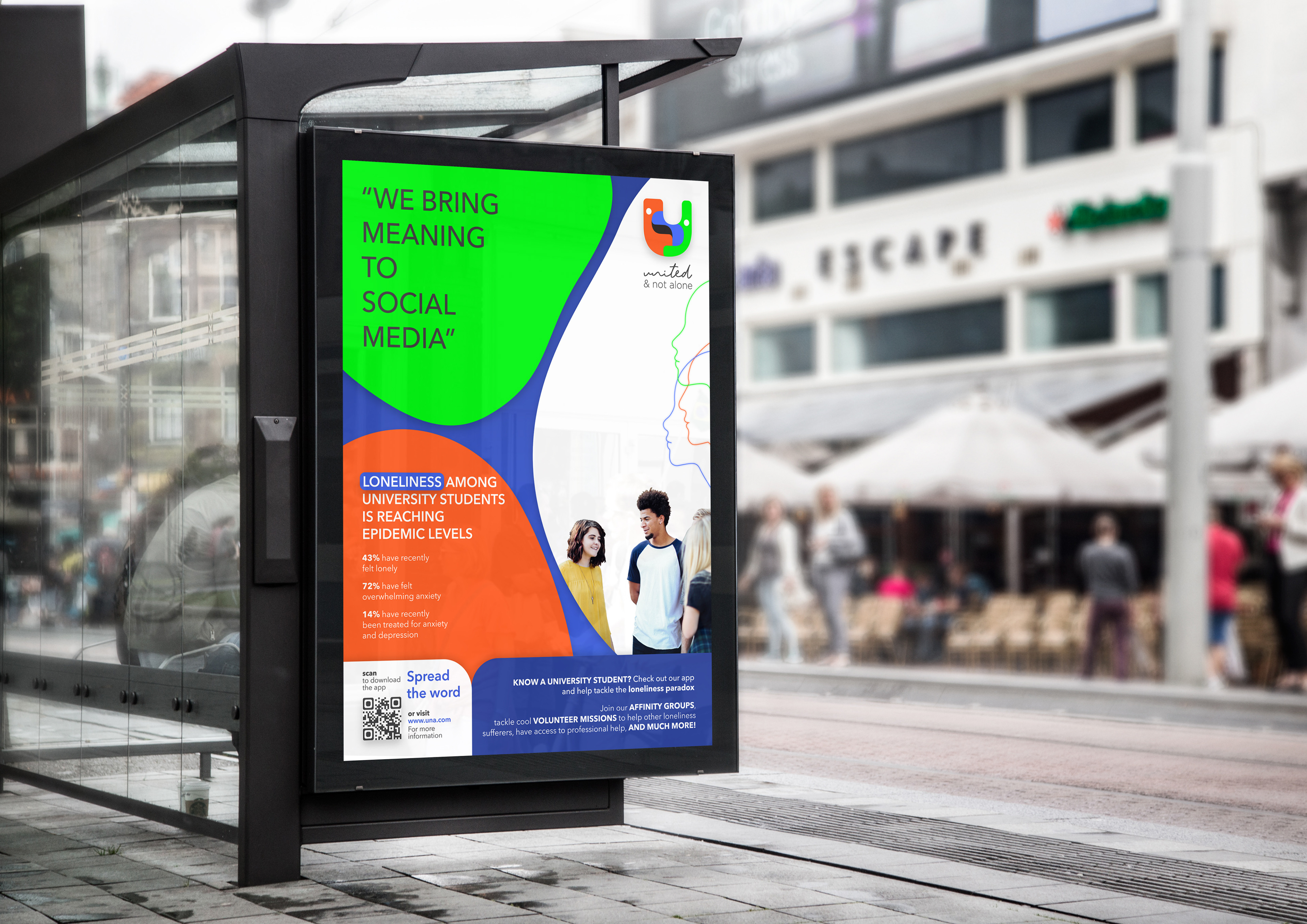
A bright combination of colours is used across the branding. Orange is often associated with youth, enthusiasm and positivity. Green is a colour that soothes and reassures, while suggesting renewal and growth. And the colour blue is essentially that of knowledge and expertise. The bright coloured shapes represent loneliness sufferers forming a protective hug, while the swallowed black shape represents loneliness itself, or the damaging structures of society.
_
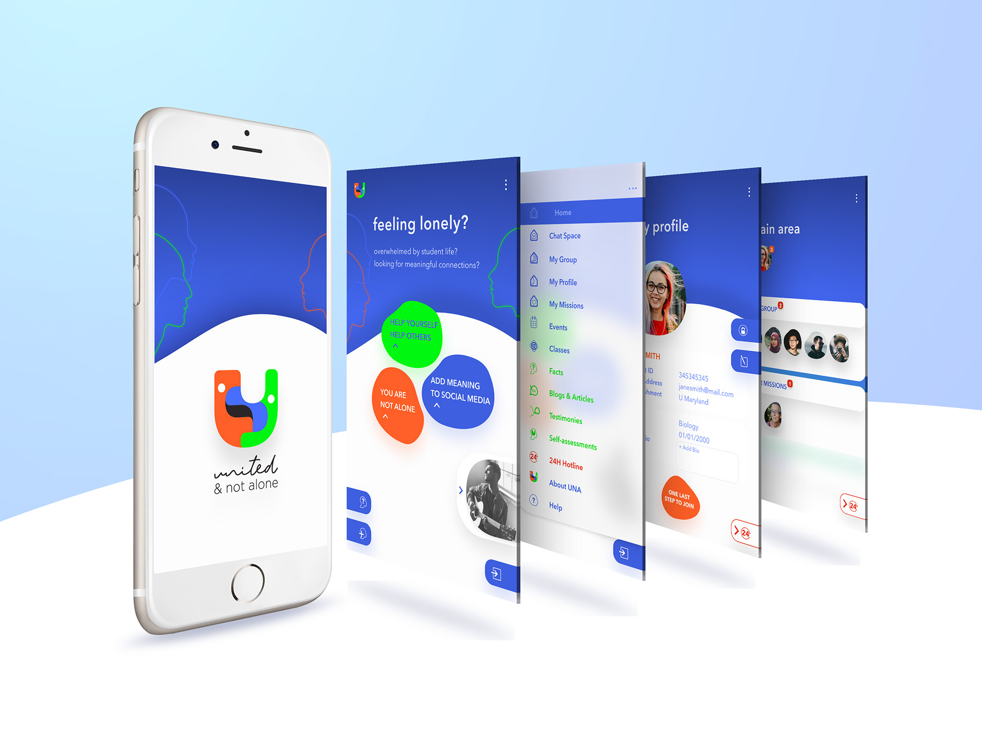
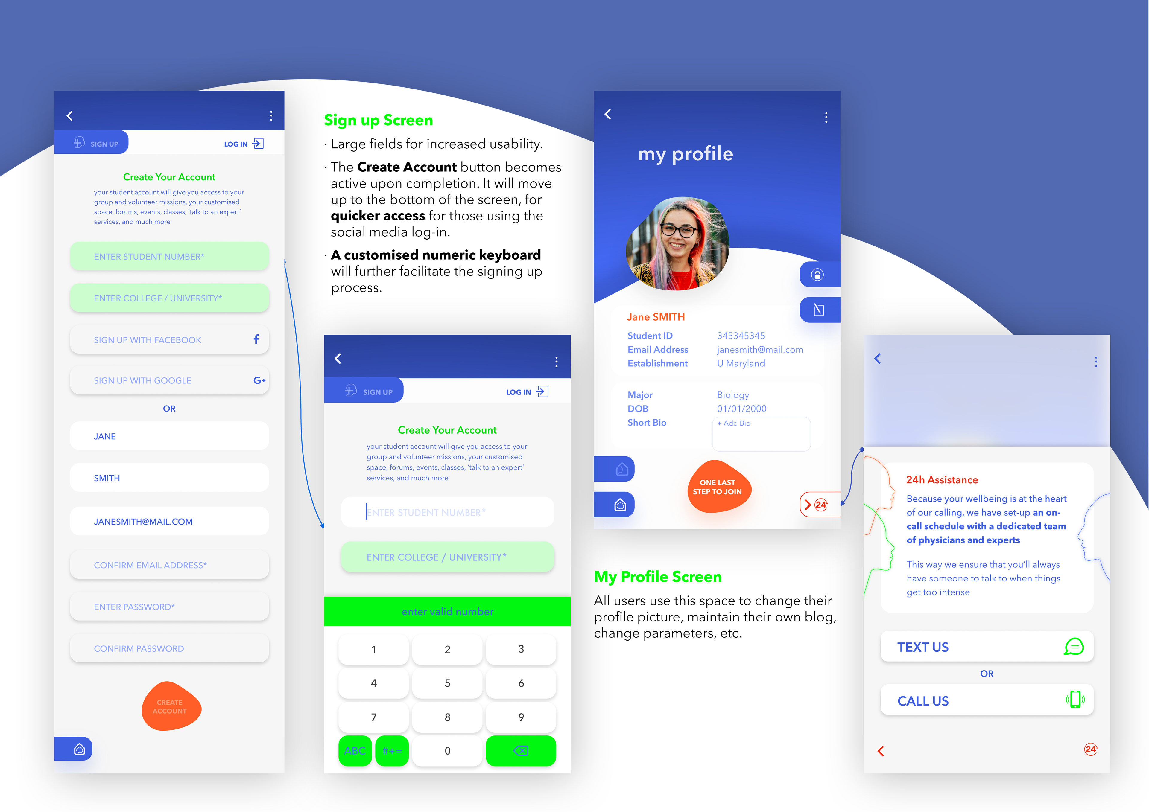
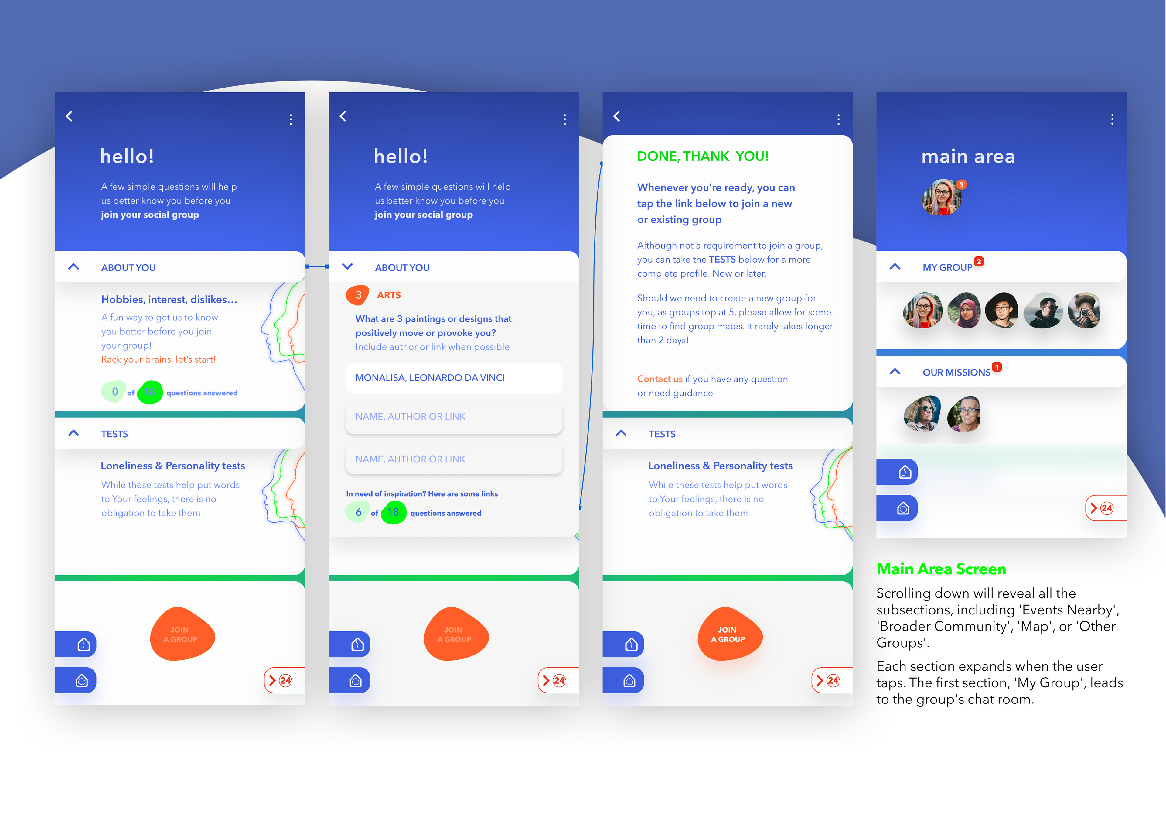
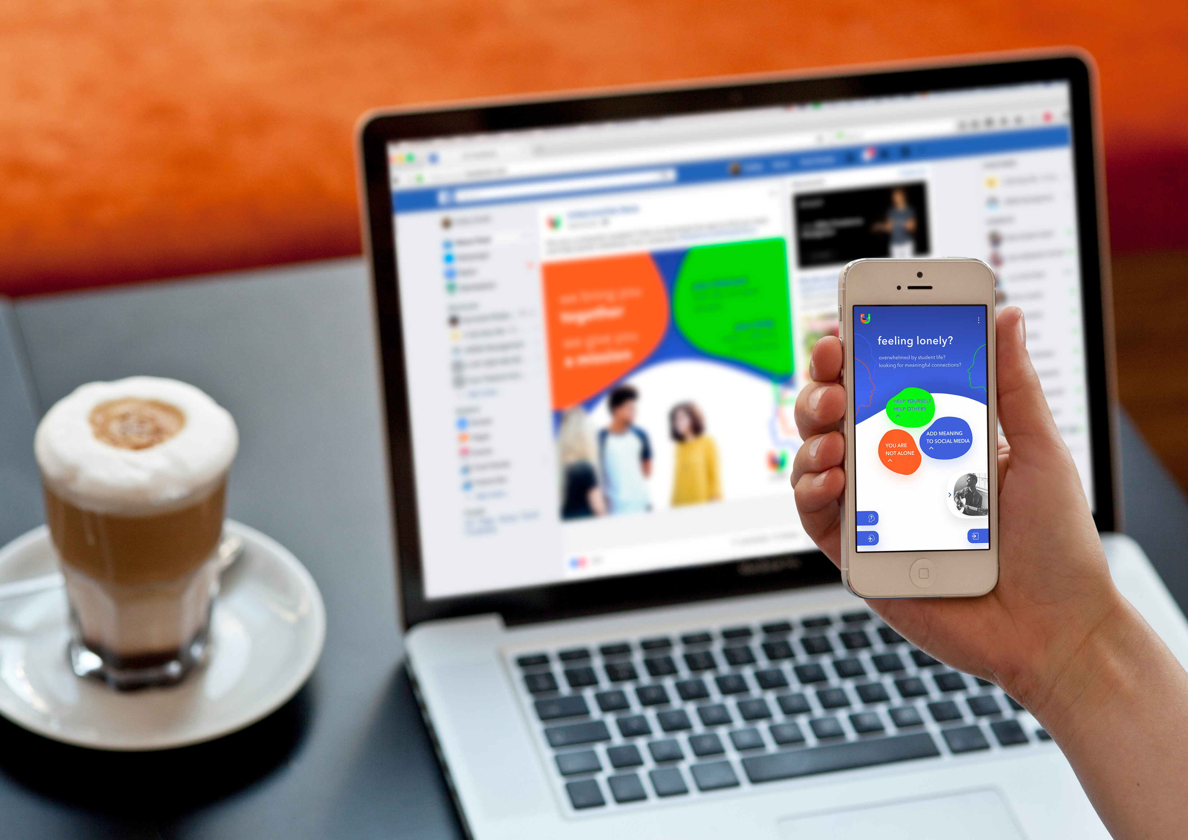
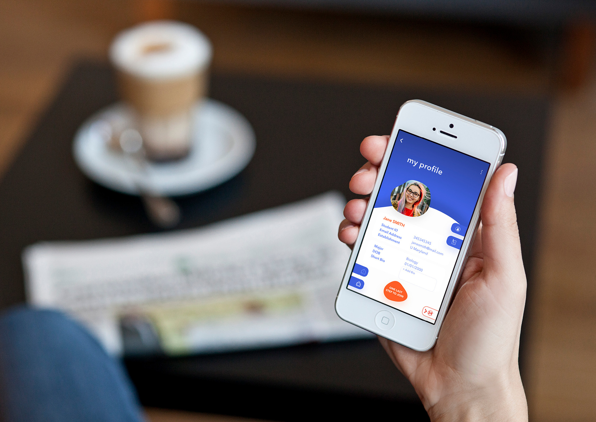
Mobile Application Prototype
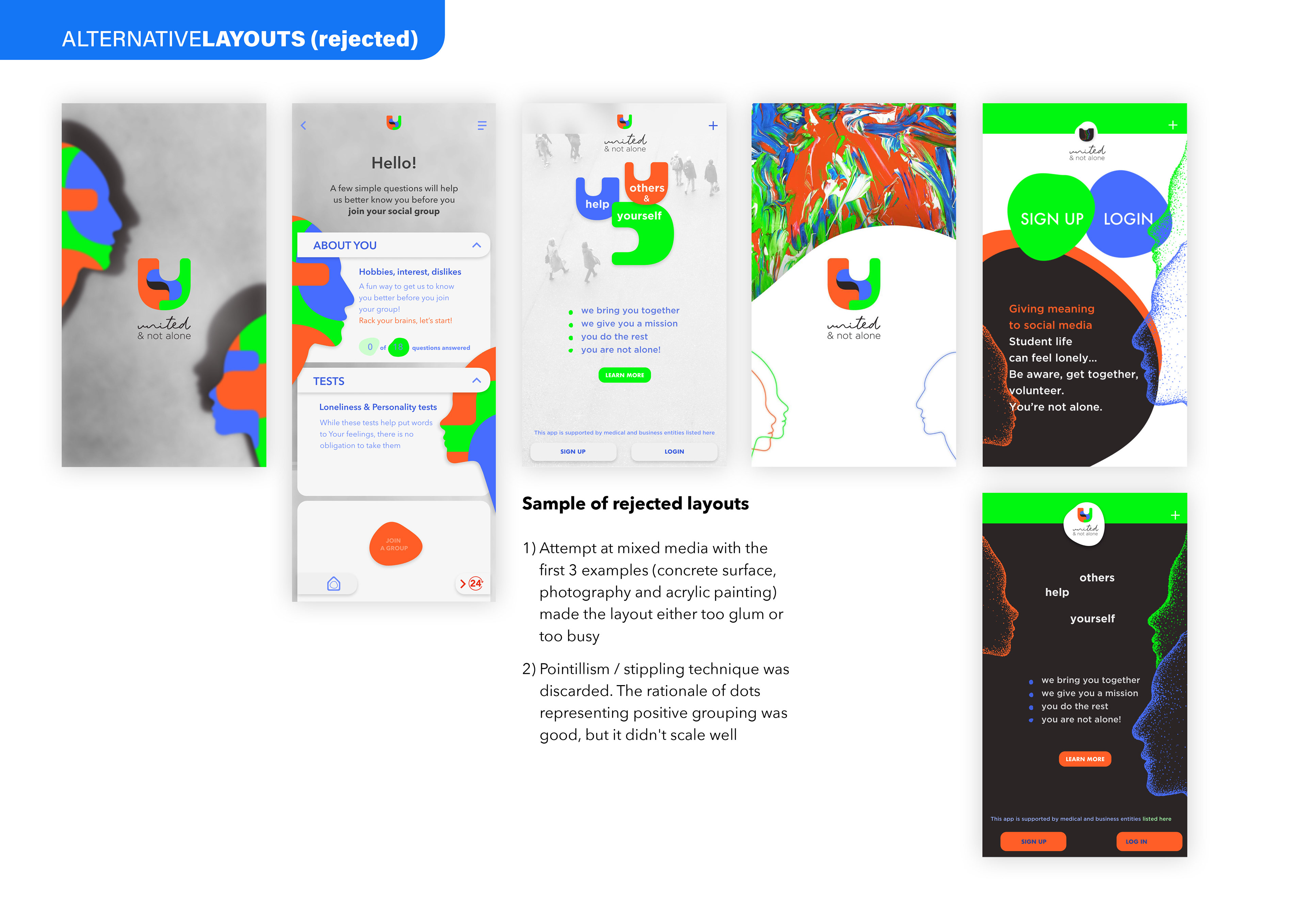
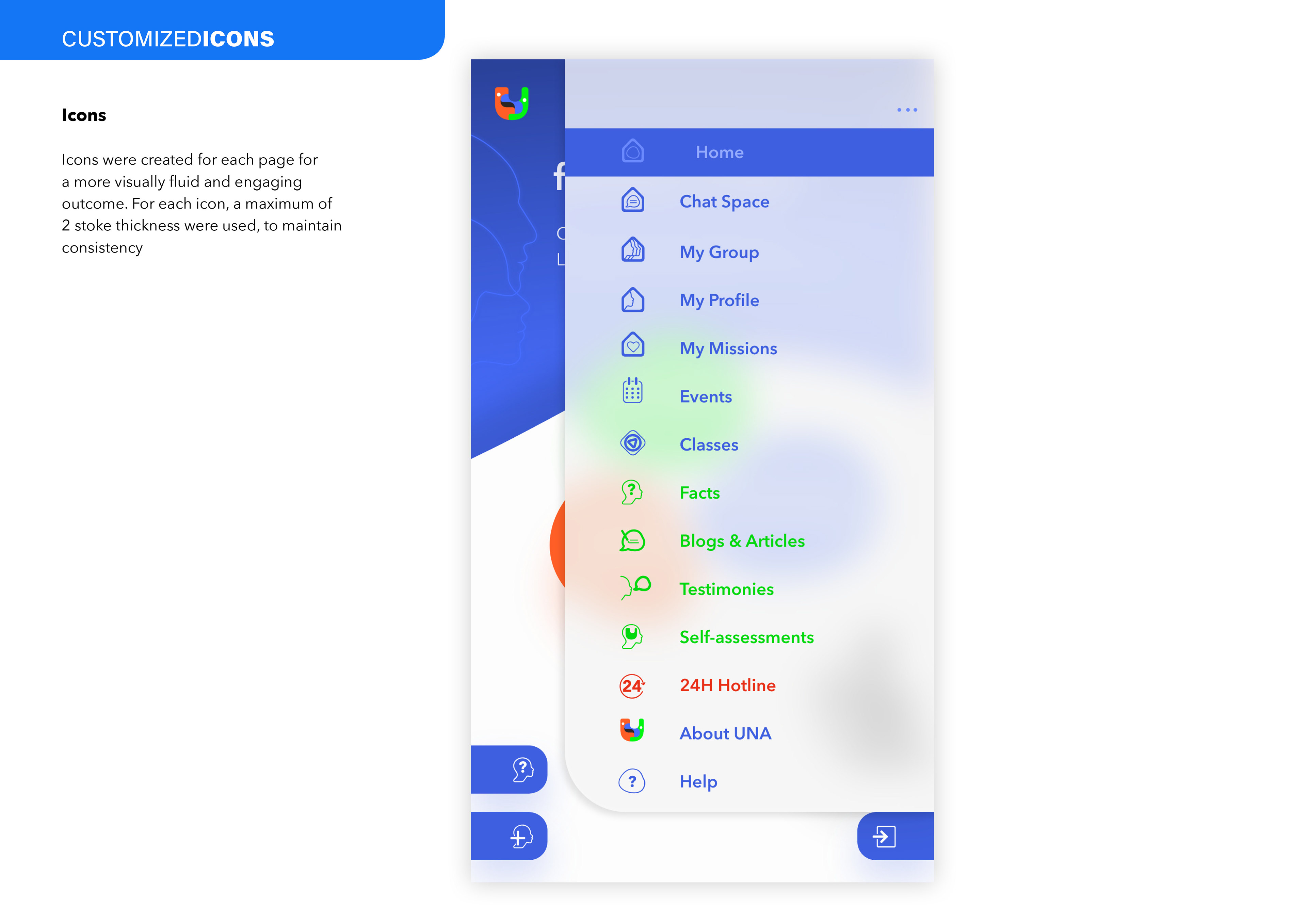
The mobile application followed three principles: simplicity, cleanness (no clutter), and usability. When putting together the content information, simplicity seemed to be the hardest challenge. The content space is small, and the need for effective usability brought on a set of typographical and layout constraints. The design elements include organic shapes of various sizes to suggest that users are now in a safe place, floating above and controlling their demons.
The neon coloured lined faces are a fixed component of the organisation's branding and appear on both the print and digital platforms. They represent loneliness sufferers but they also act as protectors, adding a soft human touch to the application. The inclusion of an influencer, a personality that the audience admires, is meant to increase awareness, visibility, and access to testimonies and other's experiences of loneliness.
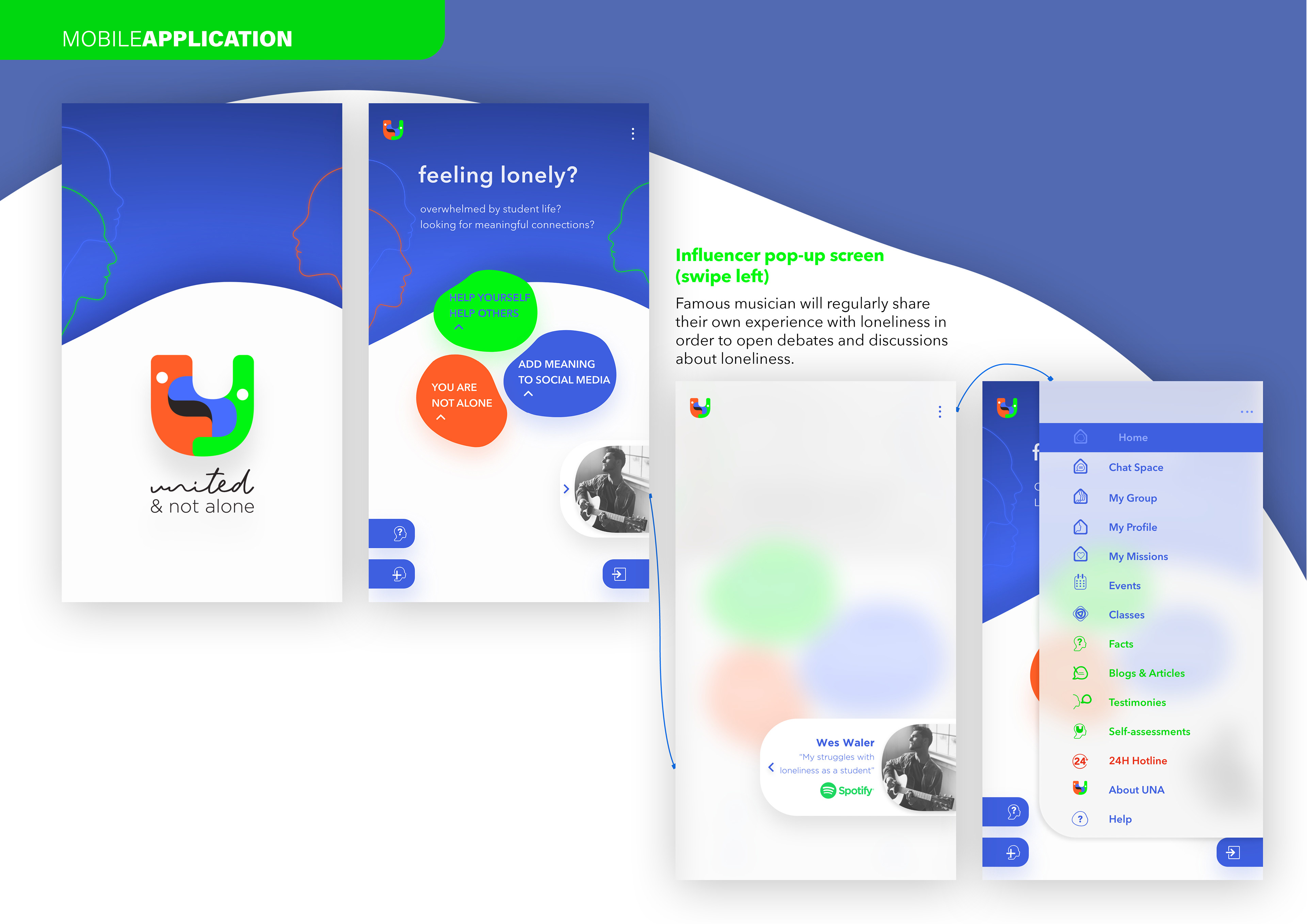
© Photo of guitarist by Hayley Reed on Unsplash.com
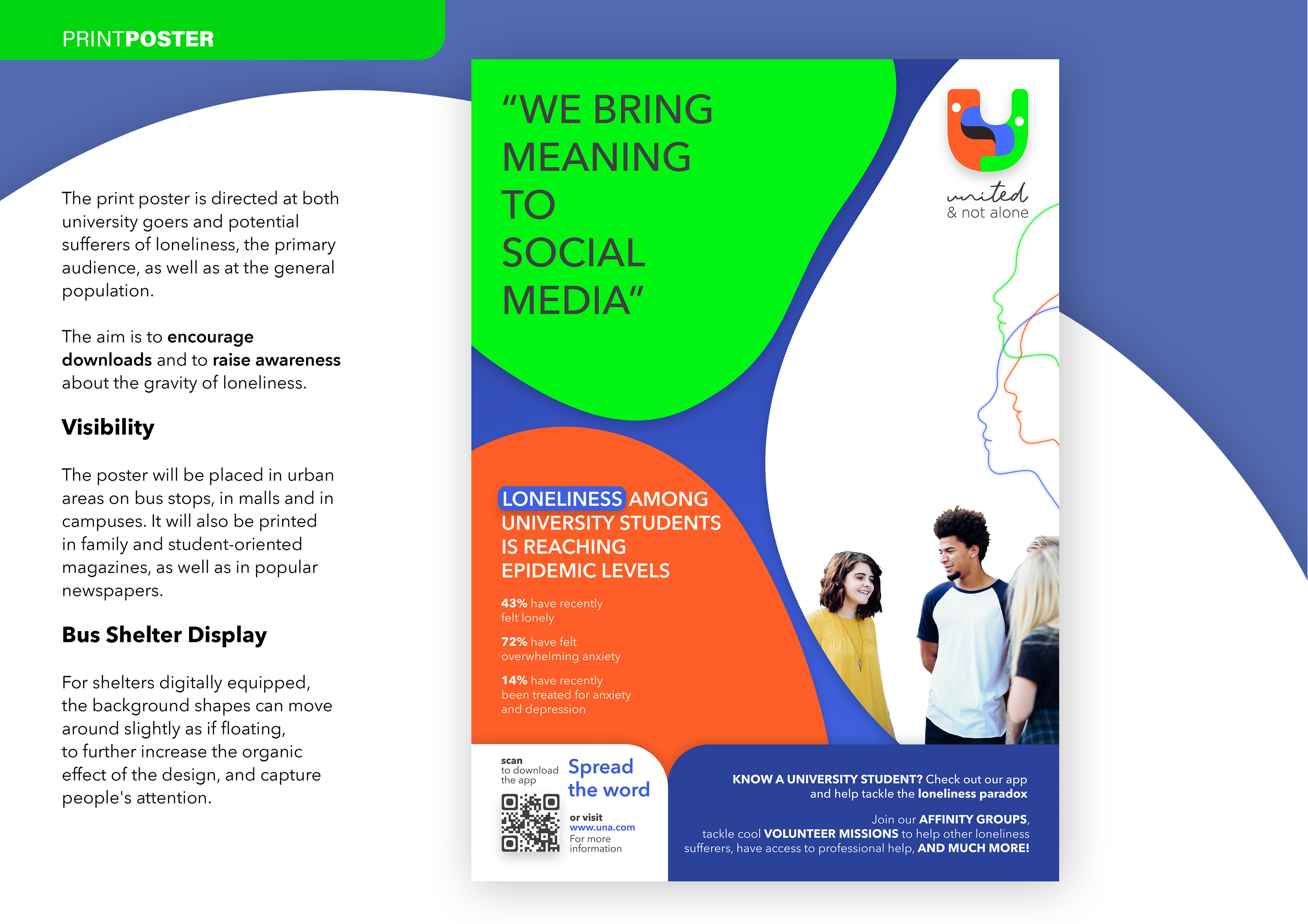
© Photo of student by Alexis Brown on Unsplash.com
_
Typography
Avenir Next was used for the mobile application, banner and poster. The low x-height and round letterforms complement the organic shapes and curved elements.
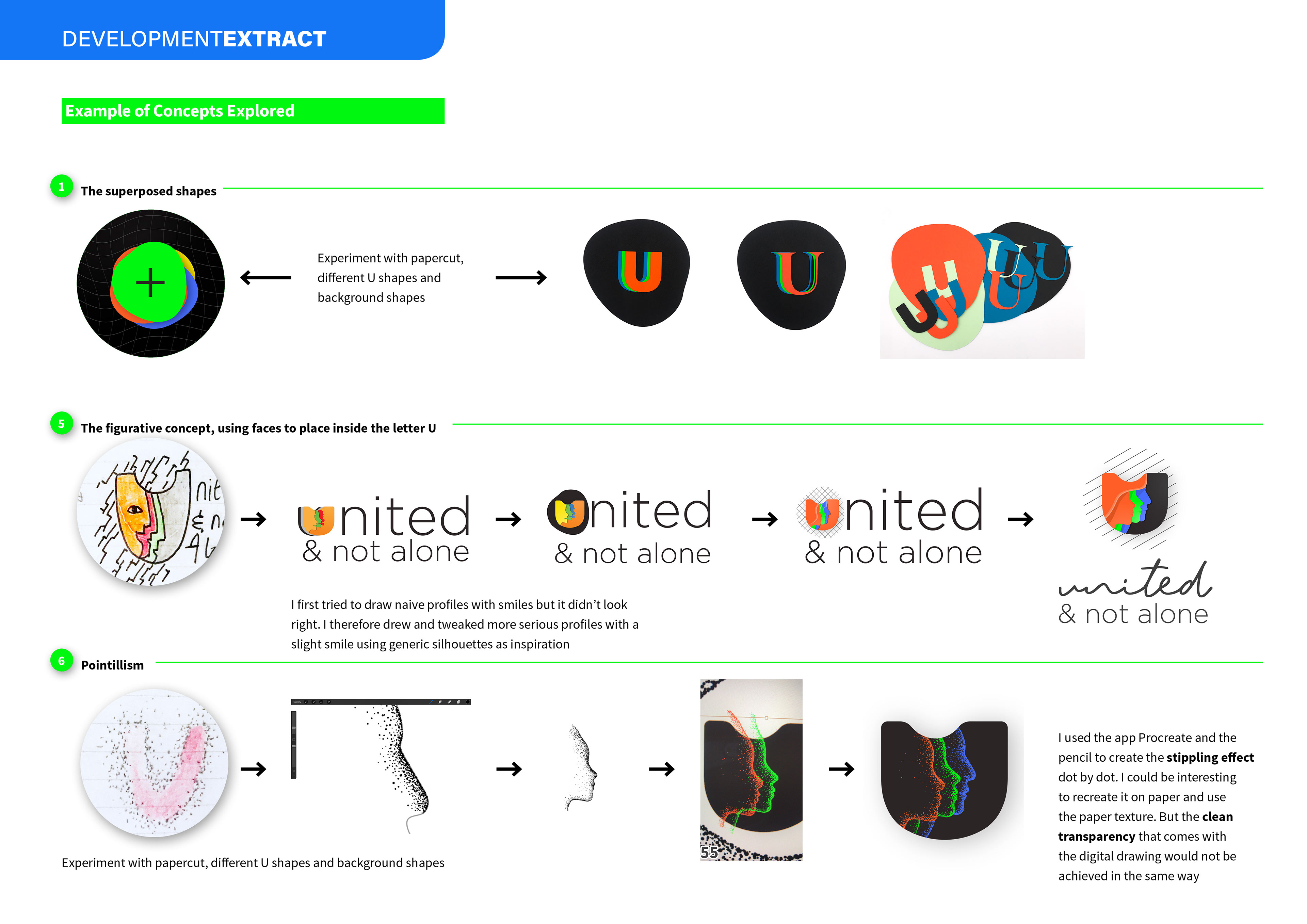
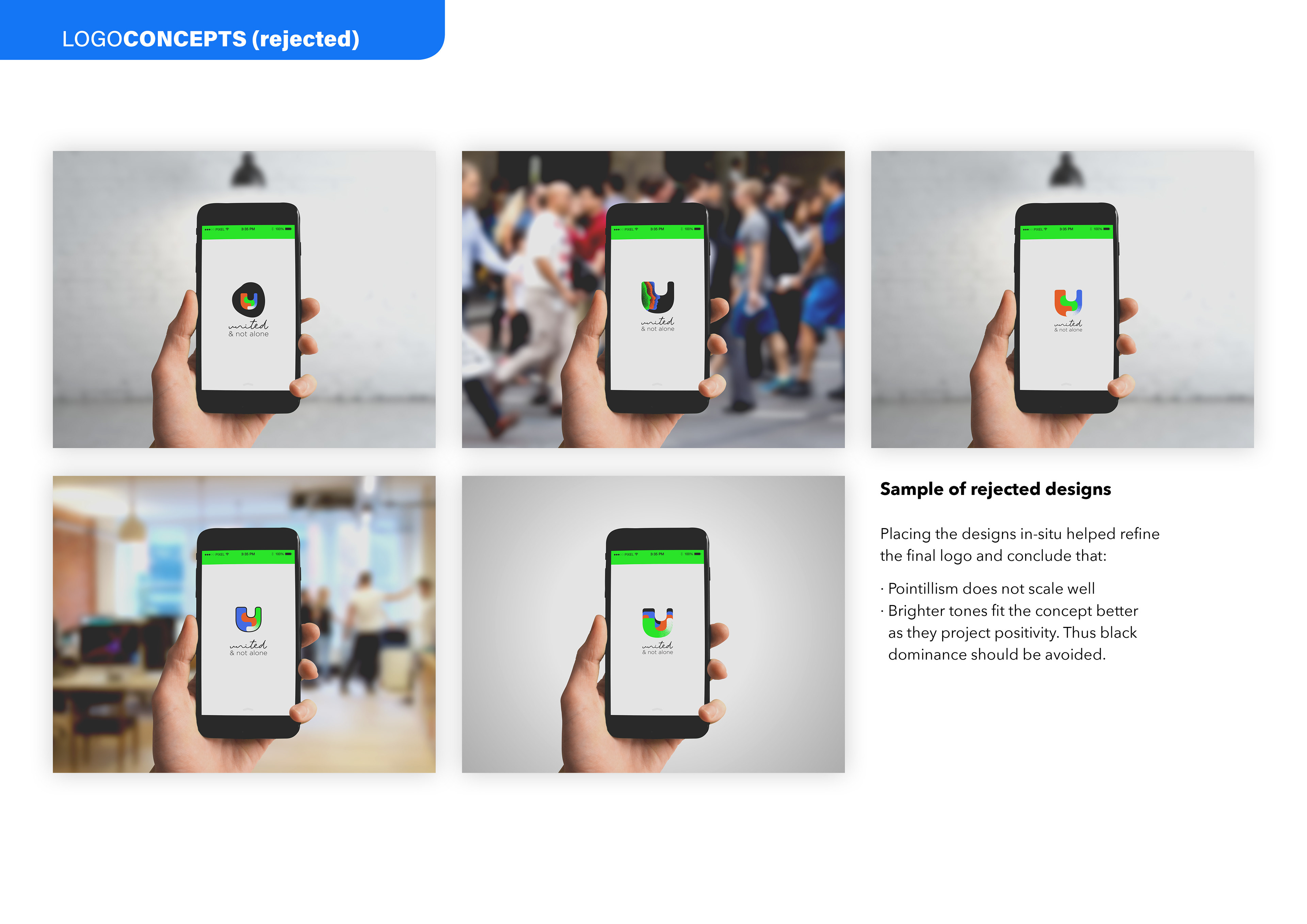
RESEARCH & DEVELOPMENT
A quick look at the ideation and development processes, as well as some rejected concepts and visuals. This give a glimpse of the reasoning and inadequate choices I made along the way, before I arrived at my final solution