
Book Covers of Lord of the Flies
Student Project
The aim of the brief was to develop and submit two alternate cover designs for Lord of the Flies, by William Golding. Below are showcased the two alternatives and some of the process that went into the development of the covers.
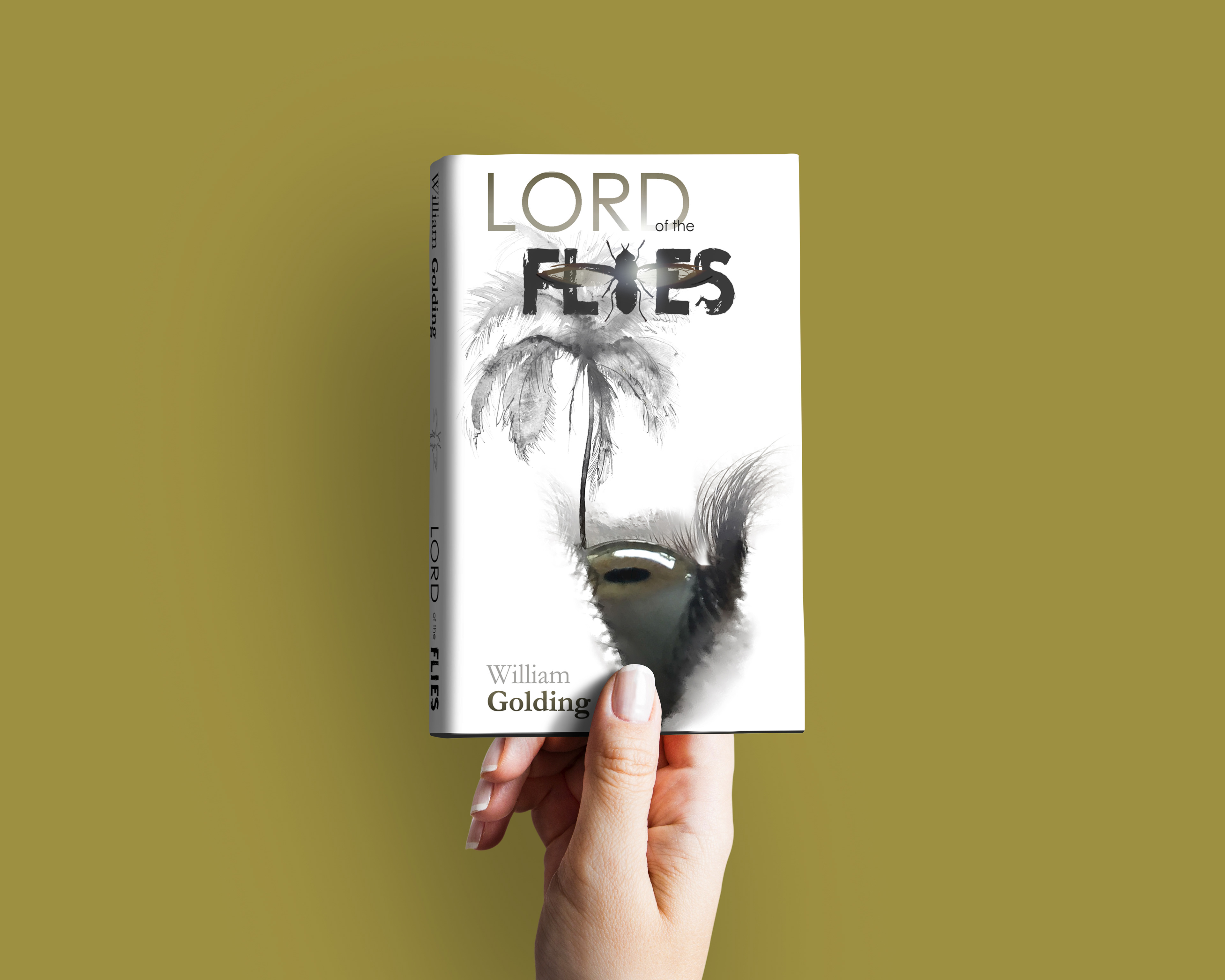
The first cover showcased was submitted as the preferred outcome.
Alternate 1

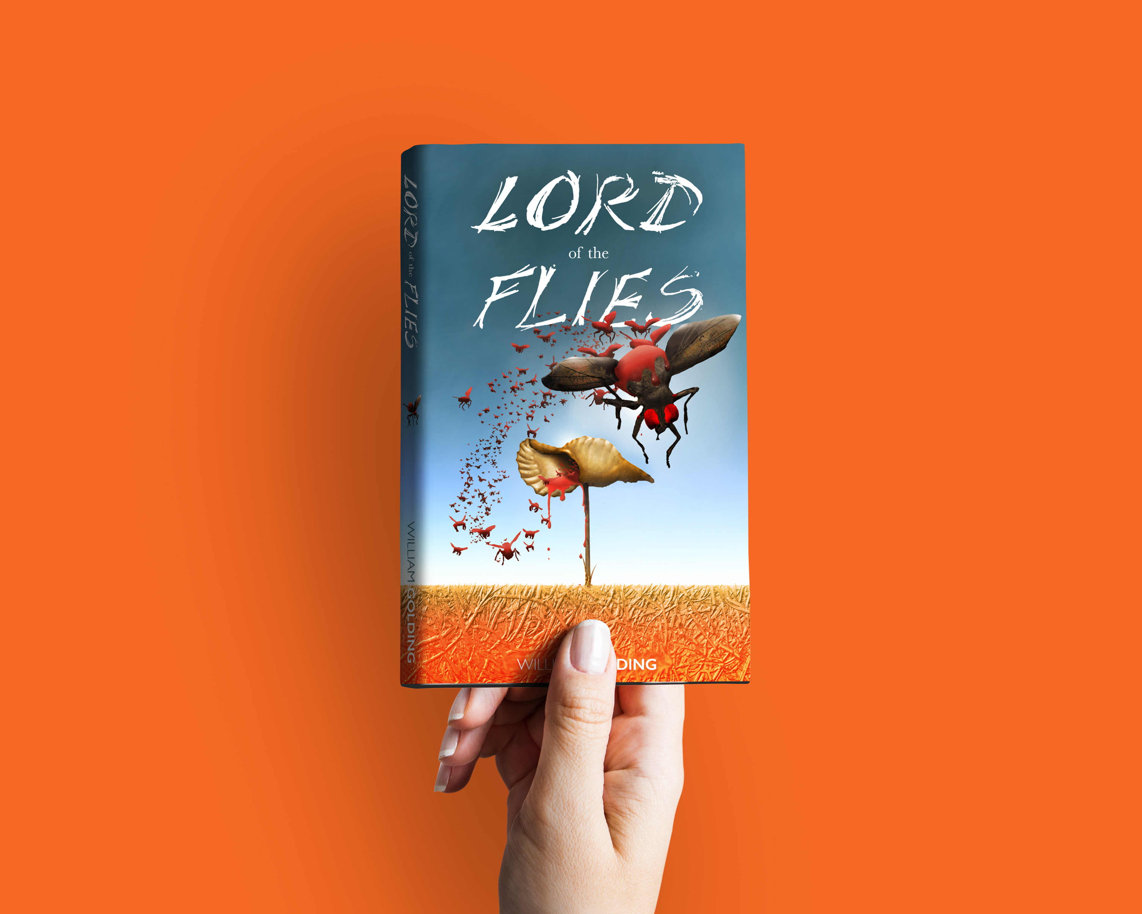
Alternate 2

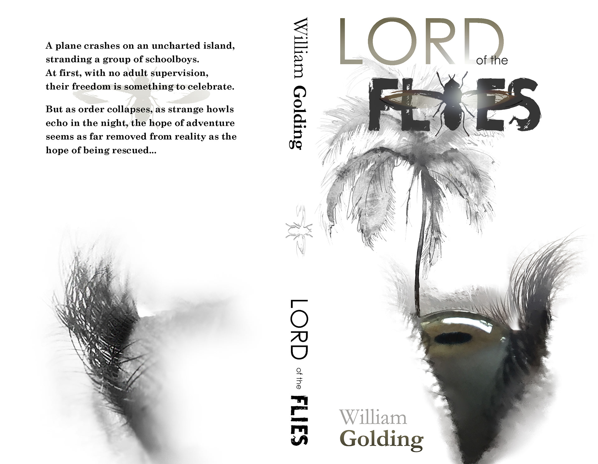
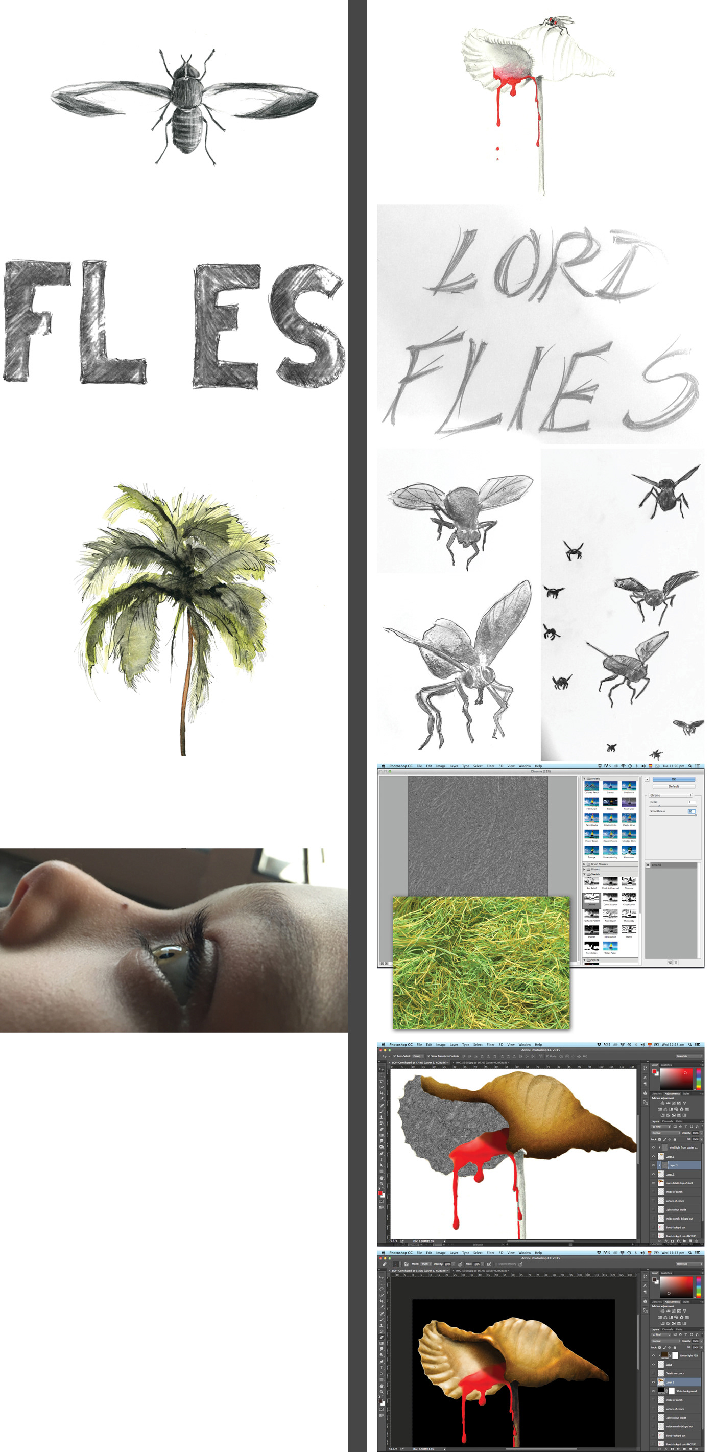
Development
Below is a selection of the final elements which were used to develop the main idea for the cover. A mix of charcoal, pencil and watercolour helped create the dark and 'creepy' atmosphere for the layout. Personal photographs were used to create the eye montage (the island). In the main title, the letter S was flipped vertically in order to create a better balanced hand-rendered type.
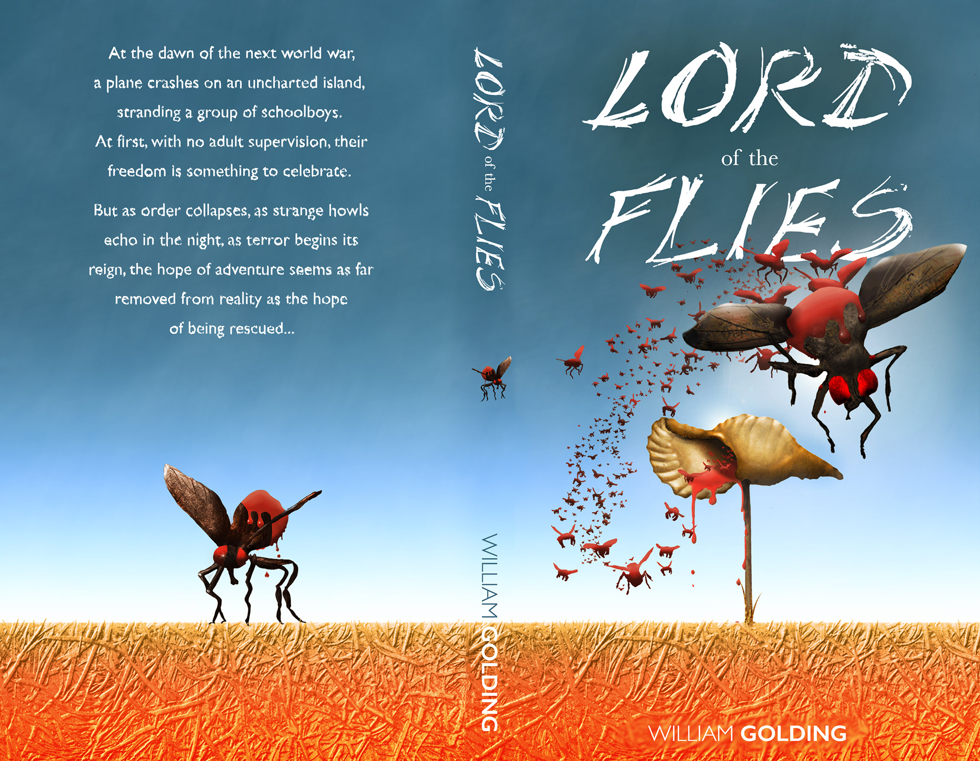
Development
Below are some of the elements which were used to create the cover. The initial sketch of the conch from which blood is pouring out; the hand-rendered title meant to convey decay and confusion; the green paper hay used to texturise the flies, conch and background...


Thank you for Watching